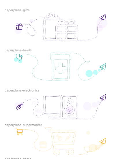
Many design decision meetings where held with the client to create a visual language for the website.
When to use illustrations and when to use people. What the images needed to convey in a way that would be on brand.
And how to create consistency between the visual elements.

One of the obstacles that I found was "how was I to create an organized way to access, edit and modify these elements?".
In one particular case, I had to create a solution for, 15 page sections, in 3 colors, with a different kinds of line per symbol, out of 2 sets of 15!
Thats about 1350 different combinations and we weren't going to need all of them either.
Nesting components wasn't going to be enough, but luckily Figma had rolled out variants that week and that made a huge difference.
Switching to FontAwesome icons and nesting a master component into different sizes, lines and colors made it possible to create the combinations I needed in minutes.


The ability to make changes with the stakeholders using a systematic approach, was efficient and allowed us to go into development faster.
