
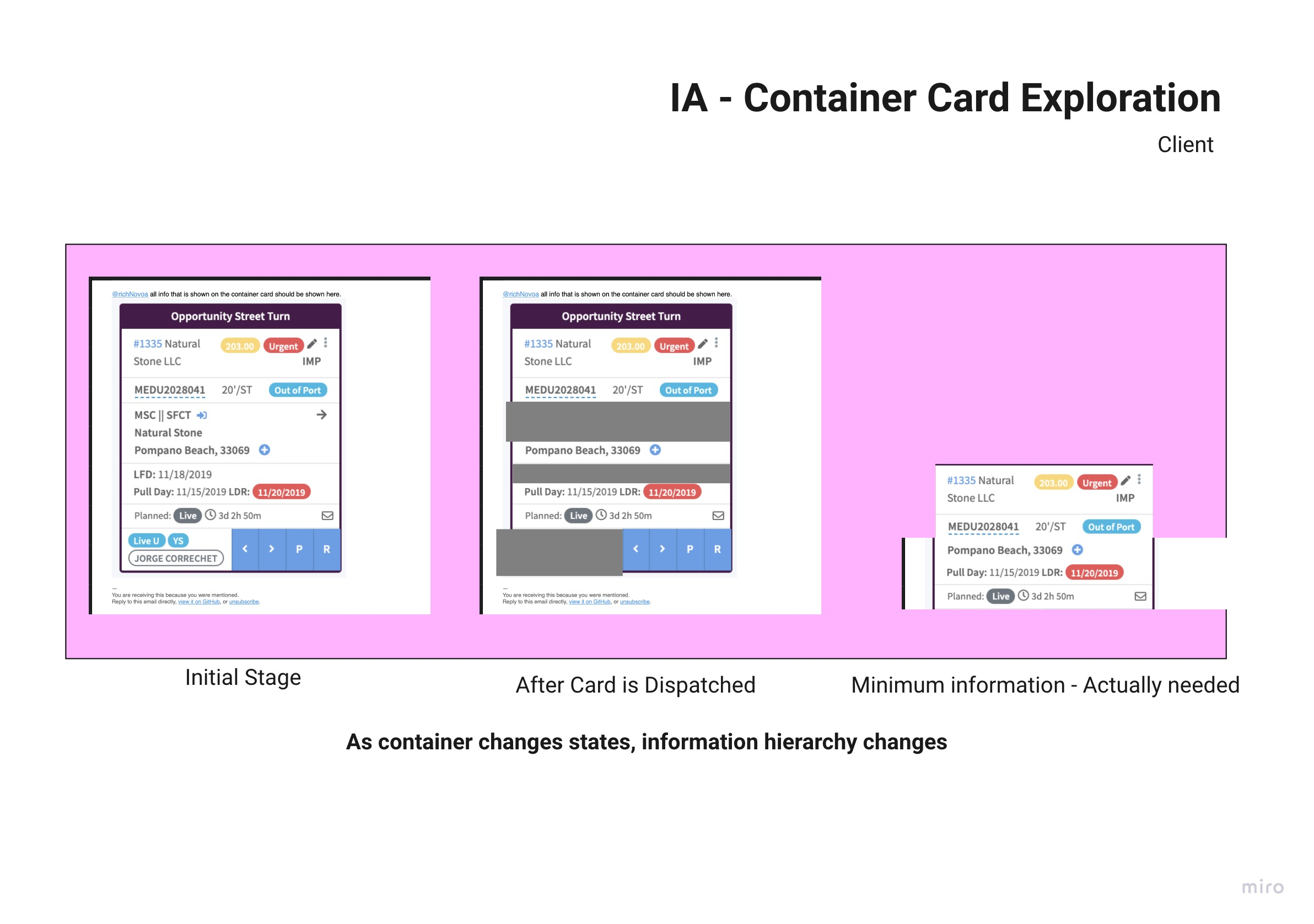
I was mapping the different endpoints on a card to get an understanding of what each one did. It became apparent that not all of the information was relevant to the user as the card moved through the logistics process.
For example, if the container did not have any hazardous material, it shouldn't have to display an inactive component for that.

Following this path I created a spreadsheet to map out what information was relevant, and showed it to a SME to get their input

This gave me enough insight, to start some rough sketching of what a card would look like with all its inputs, for each state.

After the sketches where done, I felt that I had cracked it.
The usability tests confirmed that it did not affect the user's goals.
As the visual design progressed, so did the size of the card and the information on it.


